It became apparent from the amount of time I was spending on one illustration that I needed to simplify my concept a lot or I would not have time to complete it. After rethinking and reconstructing my concept I decided to make a 'Sandwich Schedule', and partner it with an 'alternative to sandwiches' book and a money saving book.
After coming up with some initial ideas, I landed on an ikea-style approach, keeping the whole book image based and limiting text to labels. By basing the designs on a diagram, I liked the idea of overcomplicating such a simple thing, including strict measurements that give the impression that this is very precise when of course these things can be altered.
Binding
This stitch binding could lend itself to the book I wanted to make. It's simplicity strips it down and leaves you with the basics.
Similar to the first style, the way this is pinched seems in a more homely way than a scruffy way.
This binding allows you to take the book apart and while that would be an interesting idea to use I had concerns that it would over complicate the idea of the book.
Now that I've seen this I wish I had the idea for a Pantone calendar. The bolt binding is another example of simplicity which could really lend itself to the theme of my book.
I love the wooden cover, and while I'm a bit pressed for time to achieve a similar thing, a hardcover would give the book more endurance.
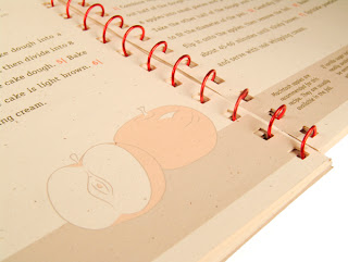
The whole theme of this book is quite similar to mine and a coil bound book might be the most effective in terms of maintaining that theme.
I had planned for each book to be quite small, the sandwich book approximately passport size and the others slightly smaller. By coil binding these books they will be given the appearance of a pocket sized book, something of an ideal size and weight to carry around.
I gathered a collection of sandwiches I wanted to include and broke them down into several categories; weekly sandwiches; hot sandwiches; healthy sandwiches; vegetarian sandwiches; left-over dinner sandwiches and treat yourself sandwiches. I started drawing out the ingredients, then scanned them in and altered them.
I used the typeface Bebas Neue as it's simple and versatile but demands some sort of authority and I thought that sort of idea would be perfect for the 'strict' measurements.
I kept the layout as simple as possible to aid the 'schedule' idea, trying to keep it looking like a diary or a planner, quite formal and basic but instead of the owner putting in the content, it's already there for them.
Since the reason of this book is primarily money saving, I included the approximate price of the ingredients per sandwich.
After our crit, I became concerned that I would not have enough time to finish all three books, since the first still wasn't complete. Similarly the crit raised some concerns I hadn't given thought to in terms of the binding. Coil binding may not work particularly well for the size given that the coils are quite big.
To resolve both of these issues, I decided it would be best to combine the three books, making it primarily a Sandwich book, which a couple of pages dedicated to alternatives and to money saving. In doing this I could enlarge the size of the book, still allowing me to coil bind it.
While I was completing the book I gave some thought to how I wanted to package it. I thought that giving a first year a book and telling them to pack a lunch would never be easy so it's important that I include something that might push them in that direction.
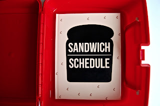
I decided to use a lunchbox as if I could find a plain one I would be able to mount my own design onto the front of it. I ordered a bright red plain lunchbox on eBay and started experimenting with some designs to feature on the front.
I wanted to find some way to incorporate both the theme of the book and the lunch box in the image and so came up with some ideas that would use both. I narrowed down my experiments to try the idea of cutting 'sandwich schedule' into pieces of bread, doing an x-ray image of the contents of the lunch box, or just including the same design as the front cover.
For the x-ray image I drew out the shapes of the contents and scanned them in to alter them. I filled them with varied grey tones.
After this, I opened the image in Photoshop and inverted the colours, giving it a dark background. I then placed it in another Illustrator document and experimented with opacity and multiple layers of the image.
However, I found while doing this that it didn't look realistic at all, and I was struggling to get the right colours and opacity in some places.
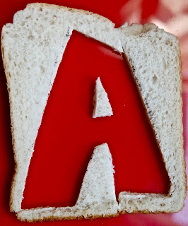
I tried cutting the letters into bread and found that it was more successful. I cut one letter into each slice of bread and photographed it individually.
I put all the images together into the shape of the front of the box and tried not to go overboard with the background given that I thought it would then become overwhelming.
I had plans to alter the front cover, so I put this on hold while I returned to the book.
After our powercrit, I received a good feedback on the theme and style of the book but was advised to experiment with colour, and perhaps alter the cover.
One suggestion was to make the front and back covers in the shape of bread slices. I tried this out and just made some really simple covers in the right shape.
However, I realised that making the book spiral bound may not result in it being to hold up well for a long period of time and I had concerns about the pages wearing at the bind so then made the decision to perfect bind it with a hardback, which would give it a higher level of endurance if someone is to be carrying it around a lot.
Making into a hardback would result in it being extremely difficult for me to bind with the front cover in a shape, and since I hadn't done bookbinding before, and was running out of time I decided to keep the hardback simple, but with the same idea:
When I was happy with the cover I started experimenting with incorporating pastel colours, choosing light shades so that it was still simple and diagrammatic instead of just looking like an image.
When comparing the colour to the black and white, it did actually help it appear like a diagram, similar to something seen in a textbook. Simple colours with a low opacity on the contents of the sandwich contributed well to the idea of overcomplicating something as easy to make as a sandwich, but still kept it simple.
I kept the contents page black and white because since there are more smaller images on this page I didn't want to overwhelm it.
In the end I used Hobs Reprographics to print and bind my book as I ran out of time to bind it. I decided eventually on a perfect bound hard back book and it turned out pretty well.
In the end I was pretty happy with the outcome of the book, it was a good size and seemed fairly useful for a first year. However, I was not as happy with the lunchbox. It was either the nature of the sticker or of the stock but it made it appear home made and didn't match up to the book well. I think it may be down to the colour of the stock, and perhaps a more off-white stock rather than pure white will have looked less home made.
I would have really liked the chance to experiment with binding and get the opportunity to try out some different methods but sadly, I ran out of time to get the chance to play around a bit as a result of the last minute changes I had to make.


