Showing posts with label Studio Brief 3. Show all posts
Showing posts with label Studio Brief 3. Show all posts
Thursday, 24 April 2014
Friday, 10 January 2014
OUGD504 Design For Print And Web Final Images
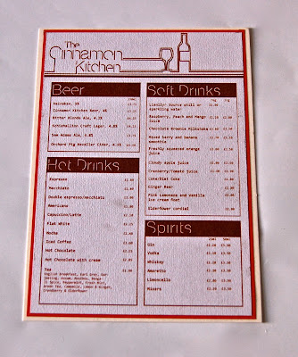
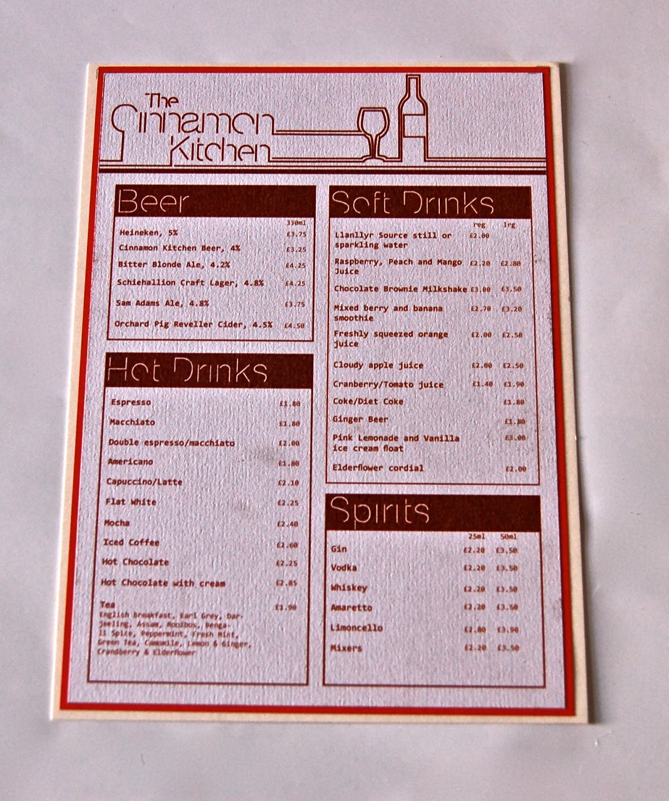
After having chosen the ivory card stock for my menu's I found that it was difficult to replicate the colour of the design on it. After discovering this I tried to experiment by going down the alternative route I was advised on while in the final crit.
I chose to print onto a light recycled stock, with the idea that the menu's aren't intended to last as long as they otherwise would have on a different stock. This would mean there would be a lot more waste, but this stock worked better with the use of the wooden board, which I decided I would mount the menu onto.
On top of this I decided to create an alternative menu design, by mounting the printed menu's onto the card stock I had originally intended to print on. This will then vary depending on meal, with the lunch and dinner menu on the mounted card stock, as to me this is a more formal meal to go out for than brunch or afternoon tea, the menu's for which will be mounted onto the wooden board.
I was unable to produce much of what I had planned due to time constraints and the loss of my purse, resulting in pretty limited options in terms of printing. However, I have tried to create alternatives to this which were routes I considered going down.


Wednesday, 8 January 2014
OUGD504 Design For Print and Web Branding Mock Ups
I had decided that the location for my restaurant would be most fitted in a courtyard style area, allowing for quiet outdoor seating, that isn't disturbed by the bustle of traffic or pedestrians on a road. I thought that if the layout of the courtyard was suited to the restaurant it could really lend itself to the homely and comfortable atmosphere.
I found an image of a restaurant inside a courtyard in London that had the ideal layout for what I would have liked as a location for my restaurant, and adapted the exterior to show my logo and colour scheme:


I found an image of a restaurant inside a courtyard in London that had the ideal layout for what I would have liked as a location for my restaurant, and adapted the exterior to show my logo and colour scheme:
I have proposed a burgundy exterior for the sign and the awnings, with the logo that has remained consistent throughout the branding. I loved the potted plants outside the restaurant which almost made it seem as though visitors were dining in a garden. The glass doors open up completely which would be ideal for the summer weather.
Branded products:
Jam Jar
I planned to have the restaurant selling their own homemade comfort foods inside (similar to that of restaurants like Carluccio's). These jars would have the same logo, but perhaps with a different illustration to the bottle and glass of wine, as this doesn't have much relevance to jam.
Plates
I used the abbreviated logo for the design of the plate and adapted it to fit the rim of the plate. I didn't want to put it in the centre as I thought it would not be seen with the food on the plate.
Biscuit Tin
In keeping with the country house theme to the restaurant, I thought it would be fitting for there to be items like homemade biscuits, cookies and cakes to be packaged and sold. I thought about using simple boxes with the logo on them but thought it would be more homely if they were packaged in something the buyer could use after finishing the biscuits. I chose a plain stainless silver tin, which would increase the price slightly but still be affordable. I incorporated both the restaurant identity and the abbreviated logo on the side.
Mugs
In order to ensure a slightly modern take on more traditionally british food and drink, I chose to use an image of a glass mug for hot drinks. I proposed for the lines coming off of the logo to circulate the mug and join up again on the other side.
Tea Bag
I chose to brand the tea bags as I could then sell these within the restaurant as an own brand of tea, as well as using them for the drinks inside. I only used the abbreviated logo for the tag, but put the full logo on the reverse side.
Napkins
For the branding of the napkins, I chose to reverse the colours, as I preferred the aesthetic of the logo in white on a burgundy napkin, and felt that the burgundy logo on a white napkin looked a bit cheaper.
I liked the idea of presenting the menu on a clipboard, as it lent itself to the rustic aspect of the restaurant, and after our crit it was suggested to do this after presenting the problem of keeping the menu's in tact. This would stop them from being damaged.
However, I do not have sufficient funds to buy a rustic wooden clipboard.
OUGD504 Design For Print and Web Crit
For the crit today, I had prepared to present my final menus, business card and letterhead, along with the product mock ups and website mock ups.
This is the feedback I received:
This is the feedback I received:
- Strong two tone colour scheme
- Significant range of concepts
- Strong consistency throughout the branding
- Consider folders to protect the menus
- Consider your printing methods and stock choices ie. matt lamination
- Think about some 'quirky' things for the interior; clipboards
The crit made me think about ways best to preserve the menu, and while I could have them printed on a thin and cheap stock, which wouldn't be reused but just thrown away afterwards, I quite want the brand to promote a natural and eco-friendly environment, therefore not wasting that amount of paper.
I narrowed it down to the idea of a wooden clipboard to mount the menu, which would give it some durability as people would not be handling the menu itself, or to mall laminate the stock, giving it some strength without appearing too laminated, as I wanted to avoid a glossy effect.
Saturday, 28 December 2013
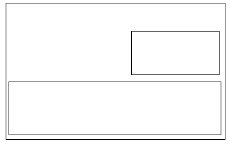
OUGD504 Design For Print and Web Website Mock Ups
I planned to have a simply functioning website as the web counterpart for this brief, as I felt it would be more applicable to a restaurant brand than an app would.
I came up with a simple wireframe to get down all of the pages that I wanted to include, and then made up some basic scamps to show the potential layout options:


I decided to use the layout that centred all of the information given, as this would allow for me to use an image in the background, of the food or of an interior that I thought suitable.

I kept the same rule of thirds layout as used for the menus, this way the layout could be different but would aesthetically work in the same way and maintain a level of consistency throughout.

I chose to differ the home page from the other pages, so instead of using any text to describe the restaurant I would just do it with images in the background of each page. With this in mind I chose to centre the logo and navigation bar more on the home page than others, making it the main focus. On other pages it will be smaller and not centred.


I placed the navigation bar just over halfway down the page, still in Helvetica Neue Light. This was it has a likeness to the logo.

I used an image of an afternoon tea tray that I found while doing research as I wanted that to be a big focus of the restaurant. However, this image made it difficult to see the text.

I didn't want to obscure the image too much so just placed some white panels with a low transparency behind the text so it is readable.


I changed the format slightly for the other pages, placing the header and navigation bar at the top and allowing room for content below:


Monday, 23 December 2013
OUGD504 Design For Print and Web Business Card and Letterhead
I wanted to maintain a level of consistency in the branding and so used the same background as on the reverse side of the menus for my business card as well. I explored some formats in which to place the logo and the details of the restaurant:


While I would have probably preferred to have done a portrait format, it transpired that the logo was most fitting on a landscape format, as there was then more balance in the focus between the logo and the information on the card. Similarly, this way I was able to include the illustrative element of it:
I experimented with some more varied layouts for the letterhead as I would have liked to follow a more unusual format:
I ultimately decided to centre the information given on the letterhead (address, email and telephone number) but to split the information between top and bottom.
Subscribe to:
Posts (Atom)