Thursday, 10 January 2013

Systematic Colour

In todays session we started learning about Systematic colour and how colours are perceived differently to each individual person and can vary noticeably. Colours are perceived on different wavelengths, with the lower wavelengths being blue and the higher wavelengths being red.


The eye has two different kinds of receptors, called Rods and Cones. Rods perceive greys and tones, while Cones perceive colour and despite the spectrum of colours we think we see, the eye only recognises three colours; red/orange, green and blue, and the three types of Cones are sensitive to each colour.


Primary colours (red, yellow and blue) can be mixed to make other colours, but no other colours can be mixed to make these three.
Secondary colours are the colours made when two primary colours are mixed together.
Tertiary colours are the colours made when one Primary and one Secondary colour are mixed together.

Colour mode RGB (red, green, blue) are Additive colours, and when all mixed together, they create white, whereas colour mode CMYK (Cyan, Magenta, Yellow) mix to make black (Key).


Complimentary Colours are two colours that will cancel each other out to create a grey, the same grey for every combination of two colours.


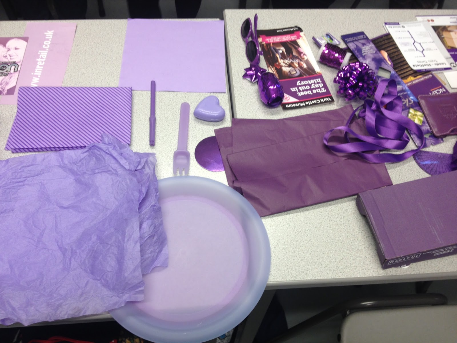
We had each gathered 15 objects of one colour and used them to make our own colour wheel.




HUE + TONE + SATURATION = CHROMATIC VALUE


HUE

Hue, and saturation each have high and low values, as does it's chromatic value. However, shades and tints are changed by a higher level of either black or white.


Pantone Colour Matching takes all of these into consideration when matching a colour. The colour can be identified using tints, shades and hues, and the combination is different for each individual colour. Pantone is an 'agreed' set or colour swatches which is recognised both digitally and manually around the world. The code of each colour swatch shows its chromatic value.

Pantone swatch books contain samples of each and every variation of colour, with specific numbers so these colours can be duplicated digitally. While digitally the colour may not appear to be the same as the pantone swatch, the printed version is exact to the swatch as it is based on the same number. The pantone system allows for designers to avoid dealing with the inaccuracies of digitally represented colour.

We chose a selection of items and used the pantone swatches to match the item to colour, which familiarised us with how to identify the variations of tone, hue etc in colours that we were trying to match, but there were still some we weren't able to be totally accurate with.


InDesign Induction

InDesign is a programme more directed at layout and publications than other Adobe programmes.


When creating a new document the page sizes need to be set as the size the finished print is planned to be to keep it to scale when designing.


Under 'More Options' the layout can be further adjusted, by adding columns, adjusting gutter width, setting margins etc..


Bleed and Slug change the print out version, by giving the bleed a 3mm border so that the print out won't be cropped. A bleed on 3mm is the most common, and is required if the design reaches the edge of the document. It allows for inaccuracies to be amended. Slug is a larger area than the print out and it contains fold marks, crop marks etc.

The pages can be laid out to face each other in a booklet format and puts them in the context they will be in when published.

New page with no facing pages and 3mm bleed:


The same way as most Adobe programmes, guides can be created under 'Layout' to use as a guideline when designing.


When inserting text or image into the document it needs to be placed in a frame to contain the text and adjust it without altering the whole document.


Word files can alternatively be placed into the frame in the document but going to File - Place - Select Document.


When there is an overflow of text (little red square at bottom right of frame) the frame can either be resized of can be divided into more than one frame in a column format. You can do this by clicking on the square and clicking elsewhere where you want the text to continue.

Images can be imported in a similar way as text, but this requires preparation on the image first, depending on whether or not it's a Photoshop or Illustrator image.

Photoshop:
Needs to be the accurate size
Needs to be in colour mode CMYK/Greyscale, not RGB
Resolution needs to be 300dpi
Needs to be saved as .tif or .psd but not .jpeg

Illustrator:
Doesn't need to be the correct size as it can be altered on InDesign
Needs to be CMYK
Needs to be a .ai file

As with inserting text, go to File - Place to insert images into your document.


The image will automatically be placed in a frame when it is put onto the document. This frame is similar to a cropping tool as it alters how much of the image will be visible.


The two circles in the middle of the image allow you to alter the size of the content itself, and its place within the frame.


For an illustrator image you need to use the rectangle frame tool first to create the frame in which the .ai file will be placed.


This image can then be altered in the same manner as Photoshop images.


Wednesday, 9 January 2013

Research, Collect, Communicate, j.r.r. Tolkien - Inforgraphics

As a starting point I looked at infographics for films in particular, as it would contain similar information that I would be using in my own.


This Trilogy-Meter by Dan Meth compares his rating of trilogies against each other.


This compares characters from Pixar films in size with a caption of their name.


This image has taken a selection of quotes from differed films and cleverly presented them as information instead of words.


This 'Film Industry by the Numbers' isn't based on a particular film but on the statistics of the industry of cinema in comparison to other entertainment industries.


This image from Information is Beautiful presents a vast selection of films in which there has been some sort of time travel, from 'Star Trek' to 'The Butterfly Effect', in a time line, allowing the events from each film to cross over.


I am particularly interested in this flow chart, advising on what to do if you were to be attacked by zombies. I thought that this design could lend itself to my topic and could easily document a plot in a more interactive way, giving the reader the opportunity to make the decisions.


This section of a diagram shows how some film genres can cross over into each other, allowing the viewer to make connections between films that would otherwise not be associated with each other.


An image by Stephen Taubmann, based on how someone would survive when confronted with a creature from a film, in this case 'Alien vs Predator'.


This timeline idea, much like the flow chart, would work well as a film synopsis without having to give much detail about the plot itself.

I started looking more at timeline infographics and found plenty for a variety of films: