We had to make some decisions on what to consider:
Who needs to know?
New students to LCA or Leeds all together.
Why?
To stop students from getting lost in the city.
How will we tell them?
With a blog, leaflet, maps and stickers in the city centre to show the route.
How will the audience interact with it?
By scanning the QR code with a smartphone which will be on the leaflet along with a simple map. The code will take the student to the blog.
Tone of voice?
Friendly, light-hearted, informative.
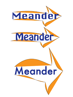
While each designing some logo ideas, it was decided that the name of the brand would be 'Meander' as it fitted the light hearted stroll or wander into town that we had in mind.
Above is an example of a logo that i experimented with on illustrator.
The two most fitting collection of logos were Roxxie and Sophie's (above), both in blue (a colour we associated with LCA) and orange (complimentary). A lot of the initial ideas included images of footprints which we decided against using as it is so commonly used in other logos and we didn't want ours to blend in with the others. We decided on one of Roxxie's designs after we had all experimented with our own on illustrator. The final resembled the red marker points seen on Google maps, which fitted our concept.
The design is simple and recognisable. We abandoned the idea of having a point as part of it that would show the direction you should be going because we would have to change the direction per sticker.
The Route
We decided the city centre would most likely be recognised as Briggate, making our final destination Harvey Nichols as it's right in the middle of the street. However, since this was aimed at students that presumably to not shop in Harvey Nichols, we changed the destination to Costa.
We wanted the map to be a much more simplified version of the Google Maps route, so Laura drew out a rough route, illustrating landmarks that a student would recognise.
Sophie and Grace put this map in the leaflet which we decided would be available at the reception and in freshers packs. The leaflet was kept simple to compliment the vibrancy of the logo.
Blog
We initially created the blog for students to upload pictures of them at the destination to, to keep people informed of updates to new or existing routes and another back up of directions if needed.
However after the group crit it became apparent that students were unlikely to use this and that a Facebook page would get more attention, tagging yourself at the destination and uploading pictures from your phone without hassle.
Above is a screen schot of our Facebook page (early on, we have more likes now). I created a new Meander Leeds profile to set up the page after which the photos of the route were uploaded.
Below are a couple of the slides from the PowerPoint. I wanted to keep it simple, without text as I thought if we could speak about the project instead of just reading off a slide about it, we would give the correct impression that we all knew what we were talking about and could explain it well, so I only put in images, examples and screen shots.


.png)


No comments:
Post a Comment