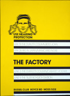
After doing some initial brainstorming, I was finding that the type I was producing was starting to look similar to each other, with little variation, and having seen some of Suzie's work from the last crit, it was difficult not to interpret her own ideas so I tried to start again. I started my research by looking into the work of Peter Saville, Suzie's favourite designer, knowing that a similar style to his would be reflective of what she finds interesting. Much of his work is very angular and minimalist, which i tried to incorporate into some of the designs I stated producing.
Work by Suzie's favourite designer, Peter Saville
Work by Suzie's favourite designer, Peter Saville
The work i was producing was starting to resemble that of 70's and 80's rock band logo's, particularly when I had the letters joined to each other so I started to look into typefaces used for album covers:


No comments:
Post a Comment