All of my feedback said that scamp number 4 was the best layout, but that there were some elements from my other scamps that I should include in this layout.
In todays session we planned to start altering the aesthetics of a webpage, with the measurements 1024x768, as this format will work on most screens, and should be altered depending on target audience (and what modem they will be viewed on).
We chose to use Helvetica for headings, and Georgia for body copy, with the menu bar on the left hand side at a 200px width, the logo with a 200px height and each button with 100px height.
We reopened the document we started on last week:
Using the code #container to reference the aesthetics of the page, without capital letters or spaces as this alters the code.
After entering the appropriate code for the container in the style sheet, we can only make this visible by adding the DIV code to the html page.
However, since we only entered the measurements we needed to change the colour in order to see that the container worked, we do this in the stylesheet.
While doing this, we also repositioned the page so that it would fall centrally in the browser, as oppose to the left alignment. We did this by first altering the left alignment to 50% across the page.
In doing this, the focus moved completely to the right, starting the left side of the page halfway across the browser. So we realigned it by entering 'margin-left:-512px;' as this is half of the measurement of the page. This allowed it to fall into the centre of the browser.
After getting this aligned correctly, we started on the navigation coding.
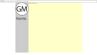
Again, in order to make this effective we had to enter the div in the html page, by setting a different colour we were able to check again if this was effective.
We then used Illustrator to create the logo and home button:
We saved the image under 'save for web' and in the images folder within the root folder.
Above is the appropriate coding, including the size, and instead of selecting a background colour, we chose background-image and browsed to find our logos.
We then created a roll over button in Illustrator, by creating layers in the Illustrator file, one with the regular button and the other with the rollover image. The code for creating a rollover button is complicated but Dreamweaver does this for us.


No comments:
Post a Comment