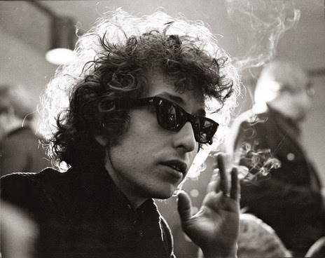
I chose to work in a more illustrative style than I usually do, and created some linear interpretations of recognisable photos of Dylan. These were the two images I chose to interpret:
I chose to keep these images linear, and to embody a similar design aesthetic to that of Dylans signature, which is quite messy and scroll-like.
To combine with the linear aspects, I chose to include splashes of colour that aren't in sync with the colour of the images. I found this approach could embody much of Dylans music, due to the sort of carefree and reckless nature of the splashes of colour.
I did this simply by dropping coloured inks over paper and scanning these in:
On top of this I also chose to include some digitally created 'splashes' of colour, as I felt it made the image slightly more diverse to combine both digital and hand rendered elements.
The two final images I created:
I found that in both of these images there may have seemed to be a bit too much going on. After asking the opinion of some other students, I was advised to rearrange the ink and to use the first drawing as it was more powerful than the second:
Final submission:


No comments:
Post a Comment