design practice
Tuesday 20 May 2014
Monday 19 May 2014
OUGD505 Final Photos
Given the time, something I think would have lent itself to this project was is I had been able to code the website, instead of just mocking it up. Unfortunately I found that I didn't have enough time to code it fully, and I didn't want to do a half hearted job of it.
I photographed the final product in a setting that I thought contributed to the theme:
I photographed the final product in a setting that I thought contributed to the theme:
Wednesday 30 April 2014
OUGD505 Packaging
In light of the rebrand, I wanted to keep the theme constant and so chose to package the bottle in a crate-style wooden box, as drinks like moonshine would have been transported. I also thought that I could add to this by lining the box with straw, which was used as cushioning for the bottles.
I thought about making the box myself, but found that not only was the wood I needed quite expensive, but I didn't think I would have the time to make it the way I wanted it to be. Instead, I looked on eBay to see what I could find that would be fitting:
I thought about making the box myself, but found that not only was the wood I needed quite expensive, but I didn't think I would have the time to make it the way I wanted it to be. Instead, I looked on eBay to see what I could find that would be fitting:
I found that the first few I looked at were constrained by size, and some also appeared a bit too well made when I wanted them to seem quite cheaply assembled.
The one I eventually bought was more like a crate than the other, and while ideally my first choice would have been for the wooden slates to appear more worn, the newer wood used allowed for it to appear more modern, which would be an aesthetic of it's mass production.
Tuesday 29 April 2014
OUGD505 Business Card and Letterhead Redesign
Again I used Copperplate for the body but tried out some variations on layout. I wanted to use a cream card stock as this best compliments the colour used.
I chose the design that I felt had imperfections that would lend to the theme, and then used the same aesthetic on the reverse side, as this would again make it slightly more modern.
I also used the same layout for the letterheads as I felt the modern layout will be able to counteract the idea of the stamp appearing hand-rendered.
While I liked the idea of using the same worn texture of the lines on the stamp to divide up the page, they were much too heavy, so I just decided to break off the bottom of the page with a simple light line in the same colour.
Saturday 26 April 2014
OUGD505 Rebrand
In light of the crit, I decided to severe the ties the brand had to the publication and use a different aesthetic, moving the brand away from the Great Gatsby theme and more towards the film Lawless, in which moonshine is being sold illegally across the US, with makeshift labelling and bottles transported in wooden crates.
I referred back to some of the research and found that this visual was quite a common theme, so I would have to take care in ensuring that it didn't end up being too similar to these.
I referred back to some of the research and found that this visual was quite a common theme, so I would have to take care in ensuring that it didn't end up being too similar to these.
I thought briefly about also using a jar instead of a bottle, but found that since it was vodka and not moonshine, it would be more suited to being in a larger bottle. I had a square shaped glass bottle of Beefeater gin that I had previously bought, and thought the shape of that would also lend itself to the theme.
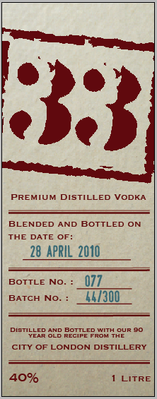
Given that the labelling and packaging for the moonshine was all quite makeshift, I decided to do a redesign of the logo, giving it quite a broken appearance as though it were stamped onto products.
I chose to use a typeface called 'Army Stamp', and then created a square shape around it to look more like a stamp.
I chose a dark burgundy colour, as the only ink that would have been used at the time would have been black, but even the colour change made it slightly more modernised. With this in mind, I wanted to make the stock similar to that of a parchment paper, as this would have been cheap and easy to get a hold of at the time.
I still used 'Copperplate' for the body copy as I felt the slight serif on it would work with the printed materials, making it also appear quite stamped.
For the reverse label, I found that older bottles and brands were often brandished with a stamp of the date they were bottled, the bottle number and the batch number. I wanted to feature this on the bottle to give the illusion that it was part of a small production.
I used a different stamp style typeface for this part of the label, called 'Stamp', which in blue resembled the aesthetics of the stamp that would be used to identify bottles.
I quickly looked at how the colours would translate when they were reversed, because a darker background could modernise it slightly.
I found that this version lost a lot of the rustic quality the previous label had, so I used the first one, with the idea of using this aesthetic perhaps on another printed product.
Subscribe to:
Posts (Atom)
.jpg)
.jpg)


