Wednesday 30 October 2013

OUGD504 Design for Web Task 2

In todays session, we were determining the content of our websites in relation to our chosen subject matter. We made out another flow diagram, this time looking at the content of each page itself.


On the home page I chose to include a brief introduction to the website, as well as top stories in the motion graphics world, perhaps including a live feed of these stories, and then went on to consider including a twitter feed in its place, following the most influential or commonly featured designers on the website.

I also chose to include an 'about' page, and while motion graphics is more or less self explanatory, it may interest viewers to learn a bit about the most popular/well known examples of motion graphics, and perhaps some of the most influential names.

I wanted to make this website predominantly news based, so I plan to break down the 'news' heading into design, film/TV and advertising to make it easily accessible to each individual field, so that viewers can easily chose what area they want to look at based on their interests.

On the 'history' page, I don't plan on going into a lot of depth, perhaps incorporating a timeline, which would explore motion graphics since it's emergence in a chronological fashion. I thought it would be appropriate to also include the future of motion graphics and how motion graphics altered the world of graphic design, film and advertising.

I am contemplating including a subscription option, which would be free to viewers but keep them updated on motion graphics all the time, syncing their phone with their live newsfeed perhaps via an app.


We went on to draw out the homepage of our website, basing the information given on it on the lists that we made concerning content. I wanted my webpage to follow a newspaper format, similar to that of thetimes.co.uk, although perhaps not as text based and with a heavier focus on imagery (and videos).
Another idea I tried was that of a 'feature of the day' which would be a motion graphic feature on a landing page, which would be updated daily based on trends within the website or new motion based releases.
This would allow the viewer to skip it and enter the site, or to automatically enter it after the feature has finished, and the viewer would then be taken to a page based on one of the other three options I explored.

After completing these, we went around the other tables with sticky notes leaving feedback on other peoples designs. My responses had some similarities:


- 'I like the idea of a landing page with the "feature of the day" - relevant to the concept of the site.'
- 'Unless you were going to put motion graphics on a landing page, I wouldn't use one as it's not relevant. Like the idea of the live feed from twitter.'
- 'Good concept, well thought, keep expanding your ideas. I like the banner on number 4.'

Tuesday 29 October 2013

Dreamweaver Induction 2

From the last session we had prepared a few scamps, as preparation for our Design for Web websites. We started this session by laying out our scamps and getting feedback from others.


All of my feedback said that scamp number 4 was the best layout, but that there were some elements from my other scamps that I should include in this layout.

In todays session we planned to start altering the aesthetics of a webpage, with the measurements 1024x768, as this format will work on most screens, and should be altered depending on target audience (and what modem they will be viewed on).

We chose to use Helvetica for headings, and Georgia for body copy, with the menu bar on the left hand side at a 200px width, the logo with a 200px height and each button with 100px height.

We reopened the document we started on last week:


Using the code #container to reference the aesthetics of the page, without capital letters or spaces as this alters the code.


After entering the appropriate code for the container in the style sheet, we can only make this visible by adding the DIV code to the html page.


However, since we only entered the measurements we needed to change the colour in order to see that the container worked, we do this in the stylesheet.


While doing this, we also repositioned the page so that it would fall centrally in the browser, as oppose to the left alignment. We did this by first altering the left alignment to 50% across the page.


In doing this, the focus moved completely to the right, starting the left side of the page halfway across the browser. So we realigned it by entering 'margin-left:-512px;' as this is half of the measurement of the page. This allowed it to fall into the centre of the browser.


After getting this aligned correctly, we started on the navigation coding.


Again, in order to make this effective we had to enter the div in the html page, by setting a different colour we were able to check again if this was effective.


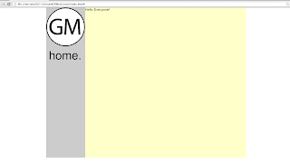
We then used Illustrator to create the logo and home button:


We saved the image under 'save for web' and in the images folder within the root folder.


Above is the appropriate coding, including the size, and instead of selecting a background colour, we chose background-image and browsed to find our logos.

We then created a roll over button in Illustrator, by creating layers in the Illustrator file, one with the regular button and the other with the rollover image. The code for creating a rollover button is complicated but Dreamweaver does this for us.


Wednesday 23 October 2013

OUGD504 Design For Web Task 1

The Design for Web brief requires us to use our summer brief topic to create a website based on our chosen subject. I research Saul Bass over the summer and aim to create a resourceful and functional website using this information.

Initially, I looked at what existing websites focusing on Bass were offering, in terms of information, functionality and target audience. I found that there wasn't much by way of an official website, the closest to which was saulbass.tv, which was sparse in terms of information.


Much of the information provided on this website is only via external links, for example above shows Bass' filmography but clocking these just leads you to IMDB. While the layout is reflective of Bass' approach to graphic design, this can be found anywhere on the internet.

Since there was little option for Saul Bass focused websites, I expanded my search, as I had decided on doing in the brain storm session, as something as specific as Saul Bass leaves little for me to do that hasn't already been done. I started looking into title sequences in general and found there were much more archives, agencies and images available.


This website artofthetitle.com is much more informative and provides plenty of examples and title-sequence related news. This pointed me in a better direction as the term 'title sequence' could fall into motion graphics which is a very vast topic, and could allow me to experiment more.


watchthetitles.com bares plenty of similarities to the previous website, in colour scheme and general make up of the website, allowing it to fall into categories like film, TV, interviews etc.

After examining a few similar websites and their target audience, I started to generate more ideas for my own, and altering my subject matter to specifically motion graphics. By doing this I can have a wide target audience in the graphic design world itself, and from examining some motion graphics websites, they mostly seemed to be more of an archive, not specifying more current or recent examples, and also seemed to be predominantly blog based.


motiongraphics.com is true to it's name and doesn't venture from that topic, but in some cases it makes the website quite narrow, which is mirrored in it's extremely simple layout, which makes it appear as though the designers were trying to make it appear dense with information.


motionserved.com is almost identical to motiongraphics.com, in colour scheme, layout and in limited content, however, motionserved.com seems to serve more as a design blog than of much informative design.

This gave me an idea for my website which would tie into the theme I was exploring for Design For Print. With a focus mainly on motion graphics, directed at graphic designers, I could design it as a counterpart to the magazine/newspaper idea I was looking into for print. Although it would not be directly related, I could allow them to fall under the same umbrella in terms of how I would be informing my audience.


After looking briefly at thetimes.co.uk, I wanted to pursue the idea of the website being constantly updated news based sites are, with recent incorporations of motion graphics in film, in design, in advertising and perhaps a brief history of motion graphics.


I identified that I needed to find a way to set this website apart from just any other fan site or design news blog, but after looking at designweek.co.uk I found that it was very limited by way of motion graphics and looked mainly at print based graphics in the media at the time.


Tuesday 22 October 2013

OUGD504 Design For Web Studio Task

In todays session we got into pairs and discussed and brainstormed the potential of our chosen Summer Brief topic when translated to web, as it is this research that we will be using to create a functioning and useful website.

My research topic was Saul Bass, and since I didn't want to just make another fan page or a biographical website, I really had to explore other options, bearing audience, tone of voice and purpose all in mind.


My first two brainstorms really showed where I needed to do some more research and proposed the obstacles I may have. For one, Saul Bass is a very specific topic, and while I had the idea of creating a title sequence archive of all title sequences ever made, Lorraine pointed out that this would be no different to YouTube. Joe suggested I make it an interactive website, in which visitors could make their own title sequence, and while I think that could be successful, it is also very ambitious given my limited knowledge in web design.

Similarly, I hit a big barrier when trying to determine what it is that I'm trying to communicate. Simply communicating Bass' work would just make the website biographical and that is exactly what I wanted to avoid.

At this point Lorraine advised I do another brainstorm, this time just starting with Saul Bass/title sequences and finding as many links to that topic as I can:


I found this challenging as I usually work much more systematically, however, it did generate some results, and may be indicating that I need to change the way in which I generate ideas.
I started by making all the connections I could think of to my topic, things that I associated with it or just things that I thought of along side it.
From this I saw potential to look into a 'how to' theme, a minimalist website, motion graphics within graphic design etc. I realised that I did want to keep the website quite minimalist as it is an area I plan on working on this year, and that in itself is related to Bass'.

I took this as indication to map out and test some other ideas before focused on any other component of the website.

Design For Web - Dreamweaver Induction

Before starting to design a website, it is important to understand that the designer must have a clear idea, concept and design for the website, as Dreamweaver is a programme that puts the design on to the web, but not a programme in which to design a website.

Limitations of Web Design

Print - 300dpi
Screen - 72dpi/96 dpi
Retina Displays - 221 dpi

This means that it is important to understand the format in which the design is likely to be viewed, because the quality can alter depending on what display is being used. This is referred to as designing for the lowest common denominator.

Similarly, not all colours translate well onto different systems, so there are a selection of web safe colours, allowing the colour to be consistent on all monitors.

Another limitation of designing for web are fonts used. The font used for the design will not be displayed on an end users monitor unless it is embedded into the page they're viewing. When you use a font that doesn't translate to the end users screen, it will be replaced with a similar option over the default Time New Roman.

Dreamweaver welcome page


Our websites will be in HTML format as it is the most simple to use.


Dreamweaver is presented in a WYSIWYG format (what you see is what you get) so design view shows the site as it would be seen online, code view shows only code, and split view splits the screen to half design and half code.


In order to understand the way Dreamweaver works, we are mainly looking and code view, and above shows the code for a blank page. Some of the coding for this page isn't necessary so we deleted the top line, excluding <html> which determines the language in which we're coding and allows the page to actually work.


The remaining coding above is all that is required for the functionality of the page. The <title> determines what will show up on the tab bar, right now shown as 'Untitled Document'. <head> is the bracket that contains the coding responsible for the functionality of the page, and all visible content falls into <body>.

All of the pages are required to be saved in a 'root' folder to ensure it's functionality when the site goes live.


In the <title> bracket I put Sarah Butler, which would show up as the name of the page, and put in 'Hello Everyone!' to sample how the coding appears.


To alter the font, we are required to create a CSS page, as this will keep the font consistent throughout the website.