In todays session we had a group crit with two tutors. I brought my scamps, wireframes and some simple visuals that I had been experimenting with before coding my website. I had begun coding, but only working out the dimensions of different elements of the website.
The feedback I received was mainly positive in relation to my concept and my scamps, but some people expressed concerns that it may be too broad a topic and that I should consider narrowing it down so that I don't have to do a lot of research. However, in spite of it being quite a broad subject, I don't consider the research to be too strenuous as the focus is on current and recent motion graphics, with a brief historical context page. I was told to consider focusing of motion graphics examples made by graphic designers over motion graphic designers, and I thought this could be an interesting concept to follow through with.
Other than this, the main piece of feedback I received was to try and crack on with the coding as it will help the design to fall into place.
Wednesday, 27 November 2013
OUGD504 Design for Web Concept Development
I found after doing some research that there were plenty of Motion Graphics blog based sites but that none of them focussed solely on recent motion graphics within the industry of Graphic Design. I feel that this is an area of design that is so captivating and is slowly becoming a topic of huge importance within the world of advertising and animation.
Below is one of my design boards that identifies the research into other webpages I did and how this informed my final concept for a website. I wanted to move away from the idea of blogs as the main focus, however am still quite interested in having some involvement from young professionals or students.

I concluded after looking at some of these sites, that I would create a website with a newsbased format, the focused on motion graphics in the news at the time, in the categories of design, advertising, TV/film etc.
I want it to be a site that people interested in this field would want to visit often and stay on to keep themselves updated in this area of design.
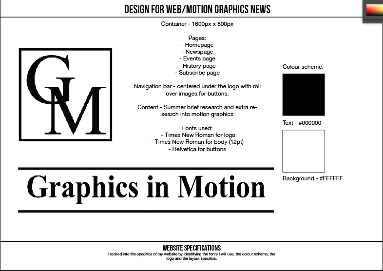
Below are the design pages that identified the scamps and make up of the website. I knew it was important for me to have a news page, since that is the primary focus of the website, but on top of that I chose to include an events page, identifying exhibitions and shows in the country that had a focus on motion graphics.
As well as this I wanted to include a history page that would allow the viewer to look at a brief history on the topic and how motion graphics has reached the level it is at today. Finally, I though it could be interesting to include the option for the viewer to subscribe to the website for free, allowing them to receive updates, new releases and perhaps gain advanced notice of competitions.


I worked out the wireframes of each individual page based on the container being 1600px x 800px, and chose to incorporate the measurements for a potential Twitter feed, and external social media links. I wanted to make the title and general make up of the content quite structured and similar to that of Times Online of Mail Online, to exaggerate the news focus of the website, and so did this by using Times New Roman for the title and the logo of the website. Apart from images I chose to keep it black and white to lend itself to a newspaper element.


Monday, 25 November 2013
OUGD503 Bob Dylan Day Brief
I chose a competition brief, which was to create a commemorative design to be used in reference to Bob Dylan as Creative Allies and Sony Legacy Recordings feature "Artist of the Month."

I chose to work in a more illustrative style than I usually do, and created some linear interpretations of recognisable photos of Dylan. These were the two images I chose to interpret:


I chose to work in a more illustrative style than I usually do, and created some linear interpretations of recognisable photos of Dylan. These were the two images I chose to interpret:
I chose to keep these images linear, and to embody a similar design aesthetic to that of Dylans signature, which is quite messy and scroll-like.
To combine with the linear aspects, I chose to include splashes of colour that aren't in sync with the colour of the images. I found this approach could embody much of Dylans music, due to the sort of carefree and reckless nature of the splashes of colour.
I did this simply by dropping coloured inks over paper and scanning these in:
On top of this I also chose to include some digitally created 'splashes' of colour, as I felt it made the image slightly more diverse to combine both digital and hand rendered elements.
The two final images I created:
I found that in both of these images there may have seemed to be a bit too much going on. After asking the opinion of some other students, I was advised to rearrange the ink and to use the first drawing as it was more powerful than the second:
Final submission:
Thursday, 21 November 2013
OUGD503 Karma Pootra
Earlier this week I was approached by some students on Creative Advertising, who were advised by their tutors to put one of their campaign ideas into action.

When I was briefed by the students and tutors, it was concluded that they wanted an A3 sized poster that exhibited all of the various hand positions of the Kama Pootra they had come up with. Below are the illustrated versions of these positions:


When I was briefed by the students and tutors, it was concluded that they wanted an A3 sized poster that exhibited all of the various hand positions of the Kama Pootra they had come up with. Below are the illustrated versions of these positions:
Butterfly
Catherine Wheel
Blow Job
69
X-Rated
Hand Job
Missionary
I had been told in the earlier meeting that they wished for this to somewhat resemble the original Kamasutra, so I looked into some of the more decorative elements of it:
After speaking to the other students, they mentioned wanting to include a henna-like design on the hands and perhaps on the background, while also maintaining the warm colour scheme used for much of the earlier examples of kamasutra.
After experimenting with tonal and colour changes, we decided it was fitting to use the colour of the hands to show the colour scheme in other elements of the kamasutra.
After making the appropriate colour adjustments, the students I was working with were already quite sure of the layout and the typefaces they wanted to use for the poster, so ultimately all we had to do was put it together.
After approving this poster with the students, we gave it to the Creative Advertising tutors, who found more problems with it that we hadn't realised, for example the connotations of the darker skin colour with the title of the poster, along with the use of henna, something that is representative of a religion, appeared to the tutors to be making racist remarks that we had not intended, nor had we even realised.
We will be returning to this brief at a later time in the year.
OUGD504 Design For Print Embossing Booklet
For the embossing booklet I planned on keeping things much more simple than the other booklets, in order to focus on the fact that embossing is more a finishing process, and to show that it is most effective in it's simplicity.

I chose a type which would typically transfer well to embossing, but found that i would not be able to emboss each character itself as I was printing double sided.


For the imagery in this booklet, I decided to carry on the decorative element over the more instructive illustrations. Since much of the booklet is made of instructive body copy I didn't want to overwhelm it. Similarly, some of the attempts that I made to adapt my photographs of the embossing process to illustrations did not translate as clearly as the screen printing or digital print images did.
I didn't want this to let one booklet down more than the others so I took a different approach, composing a simple image made up of geometric shapes, a style which translates well to embossing, and used the embossing effect on Illustrator to lend an authenticity to the design and tie it in with the theme of the book.
Wednesday, 20 November 2013
OUGD504 Design For Print - Stock, Binding and Packaging
I am limited in terms of stock choices for my booklets, as I want to have the same stock throughout the booklets, but therefore need one that works well for screen printing, embossing and digital printing. On top of this I need them to be fairly lightweight in order to fold and bind well in a booklet format.
Coated vs uncoated
Coated paper is best for:
After doing some research into packaging for the booklets, I knew I wanted something that would hold it together and stop it from being damaged, but I am keen to maintain the same aesthetics as the booklets themselves.
I designed some simple diagrams of my best ideas and mocked them up to see how they would work with the booklets:


Coated vs uncoated
Coated paper is best for:
- photographic printing
- illustrative printing
- creating a smooth and professional finish
- variety
- digital printing
Uncoated paper is best for:
- books
- daily magazines
- designs that include a lot of text
- designs that require a lot of attention (no light reflection)
- more recently used for catalogues and brochures (more exclusive design)
- cheaper
Weight
Weight is required to be heavy for the embossing and screen printing booklets, otherwise these processes will not be as effective. However, the weight still needs to be light enough to effectively fold into a booklet format and can be simply bound without being too bulky.
Opacity
A lighter stock will have a lower opacity, meaning that while it may fold easily into a booklet, some of the ink will appear on the other side. Higher opacity will ensure this doesn't happen but as it will be heavier will be more difficult to format.
I concluded to try making the booklets all in uncoated paper, preferably cartridge as this will allow the prints to transfer well and will maintain consistency with the other booklets.
However, I had a concern that this stock may be too heavy to fold well into the booklet format. I still wanted to show the process on the exterior of the booklets, so if this is the case I concluded that I would choose a lighter stock for the pages on the interior, using the cartridge paper as the cover.
Binding
Ring binding
Good binding method for manuel types of publications. It is better for more heavy duty booklets.
Coil binding
Best for notebooks, booklets, reference materials and calendars. Again may not be necessary for smaller booklets with fewer pages.
Stitched binding
Saddle stitching is most used for booklets and pocket sized books. Works well for smaller booklets with few pages.
Perfect binding
Paperback books, booklets and magazines, but would need more heavy duty page count.
I concluded that saddle stitch binding is the most appropriate for the format my booklets will be taking, as I plan for them to be slightly larger than the average pocket sized book and is the most appropriate for the page count.
Packaging
After doing some research into packaging for the booklets, I knew I wanted something that would hold it together and stop it from being damaged, but I am keen to maintain the same aesthetics as the booklets themselves.
I designed some simple diagrams of my best ideas and mocked them up to see how they would work with the booklets:
The form I liked the most was the box like sleeve that holds all the booklets inside it, however, the only thing that is to be making the booklet a series is the layout, so I didn't know how to design the aesthetics of the exterior, and ultimately decided that the most appropriate option is the individual sleeves for each booklet.
Following this decision, I made a more detailed net of the packaging, with the dimensions 130mm by 170mm, so that they were slightly larger than the booklets, allowing them to slot inside easily.
I would be digitally printing the 'In Print Condition' booklet, so used this design to work out the aesthetics of the packaging.
I needed to ensure durability with the packaging as this is what would be protecting the booklets:
Cartridge paper
- used more for drawing
- heavy stock will ensure durability
- inexpensive
Cardboard
- made up of layers, so thicker and more durable than paper
- thickness may make construction more difficult
- inexpensive
Duplex Board
- used for containers so waterproof, would be durable in the print rooms, not damage the inside
- recyclable
- wax-like texture, not easily stained
Solid Board:
- best for printing
- appears expensive looking
- harder to construct and format to the net
I decided to experiment with cartridge paper, as this is easy to get hold of and inexpensive. I thought this would work well as I need it to stop the booklets being damaged on the inside, baring in mind the booklets are most likely to be kept in a bag or pocket, so shouldn't face too much disruption.
Subscribe to:
Posts (Atom)