Sunday, 29 December 2013
Saturday, 28 December 2013
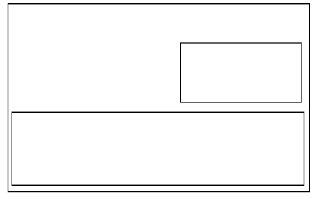
OUGD504 Design For Print and Web Website Mock Ups
I planned to have a simply functioning website as the web counterpart for this brief, as I felt it would be more applicable to a restaurant brand than an app would.
I came up with a simple wireframe to get down all of the pages that I wanted to include, and then made up some basic scamps to show the potential layout options:


I decided to use the layout that centred all of the information given, as this would allow for me to use an image in the background, of the food or of an interior that I thought suitable.

I kept the same rule of thirds layout as used for the menus, this way the layout could be different but would aesthetically work in the same way and maintain a level of consistency throughout.

I chose to differ the home page from the other pages, so instead of using any text to describe the restaurant I would just do it with images in the background of each page. With this in mind I chose to centre the logo and navigation bar more on the home page than others, making it the main focus. On other pages it will be smaller and not centred.


I placed the navigation bar just over halfway down the page, still in Helvetica Neue Light. This was it has a likeness to the logo.

I used an image of an afternoon tea tray that I found while doing research as I wanted that to be a big focus of the restaurant. However, this image made it difficult to see the text.

I didn't want to obscure the image too much so just placed some white panels with a low transparency behind the text so it is readable.


I changed the format slightly for the other pages, placing the header and navigation bar at the top and allowing room for content below:


Monday, 23 December 2013
OUGD504 Design For Print and Web Business Card and Letterhead
I wanted to maintain a level of consistency in the branding and so used the same background as on the reverse side of the menus for my business card as well. I explored some formats in which to place the logo and the details of the restaurant:


While I would have probably preferred to have done a portrait format, it transpired that the logo was most fitting on a landscape format, as there was then more balance in the focus between the logo and the information on the card. Similarly, this way I was able to include the illustrative element of it:
I experimented with some more varied layouts for the letterhead as I would have liked to follow a more unusual format:
I ultimately decided to centre the information given on the letterhead (address, email and telephone number) but to split the information between top and bottom.
Saturday, 21 December 2013
OUGD504 Design For Print and Web Menus
I designed the menu's in varied formats, the drinks menu as A5, and planned for the breakfast and afternoon tea to be A4 and the lunch and dinner to be A3.
They all were to follow the same format and colour scheme, perhaps with some varied layouts based on my initial design ideas:


They all were to follow the same format and colour scheme, perhaps with some varied layouts based on my initial design ideas:
I planned to use my logo as a heading to the menu's with a burgundy border. I plan to use a thick stock with cream or ivory tones which will compliment the burgundy.
I used guides in rule of thirds as I thought this would allow me to have either 2 or 3 evenly placed columns on the page, which were the formats I found to be most readable when designing some layout ideas.
I decided to make the drinks menu double sided, with one side featuring alcoholic drinks, and the other with soft drinks and hot drinks. I carried on using the typeface I designed for the logo, to maintain the idea of this being the identity of the brand. Since this was to be A5, I decided to only have 2 columns, as a though 3 may cramp the page slightly.
I did some research to find some appropriate and affordable drinks for the menu to ensure it's authenticity. I chose to give a brief description of each drink and it's percentage.
I followed this same format for all of the menu designs, however, the breakfast/afternoon tea menu and the lunch/dinner menu were one sided, so I placed the logo on the back of each in a reverse colour scheme:
Drinks
Breakfast/Afternoon Tea:
Lunch/Dinner:
Subscribe to:
Posts (Atom)