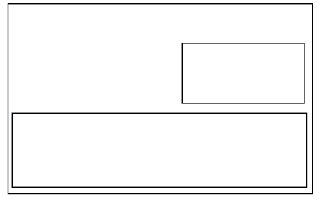
While I would have probably preferred to have done a portrait format, it transpired that the logo was most fitting on a landscape format, as there was then more balance in the focus between the logo and the information on the card. Similarly, this way I was able to include the illustrative element of it:
I experimented with some more varied layouts for the letterhead as I would have liked to follow a more unusual format:
I ultimately decided to centre the information given on the letterhead (address, email and telephone number) but to split the information between top and bottom.


No comments:
Post a Comment