Monday, 20 January 2014
Wednesday, 15 January 2014
OUGD503 D&AD The Body Shop
I chose to keep the layout and format of each poster very simple, including the name of the product, the logo and some sort of tagline to use alongside the product that refers to its use. With this in mind I used a basic rule of thirds guide for the posters and kept the positioning of text simple with subtle variations.


I decided to include some sort of pun or frequently used phrase to assign to each product, as I thought that this would make that product more memorable to the viewer, similarly, they will be reminded of that product if the phrase associated with it were to come up in conversation.
After brainstorming some ideas for them, I found a selection that I thought were appropriately applicable to each product.
In terms of typographic choices, I wanted to choose something light and simple, but that would also be able to hold its own against the slightly busier background. I felt that since I had chosen not to use a lot of type or image that it was extremely important for the little text I do use to jump out as much as possible.
I chose to use Helvetica Neue Ultralight, and by experimenting with the size I was able to make this light text appear demanding of attention.
I changed the colours around once I applied the background images as the black wasn't working against the more vibrant colours:
I used a slightly different format for the campaign poster as it would be carrying more information on it than the product posters:
Once I had chosen an initial format, I put all the appropriate information for both The Body Shop and Refuge, including a brief explanation of the charity, it's logo and The Body Shop's logo.
Tuesday, 14 January 2014
OUGD504 Self Evaluation
What skills have you
developed through this module and how effectively do you think you have applied
them?
The skills I have developed most are in web design, as I entered 2nd year knowing nothing about it and have managed to produce a functioning website over a couple of months. My skills in branding and production are constantly developing and I am applying all the things we learn about effectively. I aim to spend more time planning my work thoroughly in the next module to ensure I don't have to adapt my work based on problems I face.
What approaches to/methods of design production have you developed and how have they informed your design development process?
I have developed my printing skills, particularly in screen printing and embossing. I am also constantly learning new things about different stocks which has informed some of my design and production decisions effectively, allowing for me to consider things outside of just the design.
What strengths can you identify in your work and how have/will you capitalise on these?
I can identify some strengths in the branding side of my work but would like to develop this further. I would like to experiment more with different processes of production and not just rely on a couple. This will add new dimensions to my work and give me a more diverse portfolio.I have had to make some informed decisions regarding the production of my work, as I lost my purse a few days before the deadline, and so had to make do with the printing facilities I could afford. This has taught me how to find alternatives under the pressure of the deadline.
What weaknesses can you identify in your work and how will you address these in the future?
I have again identified that I have weaknesses in my time management. While I felt I rectified this in 1st year, this year we have very much had to manage ourselves and our own time effectively and there have been some imbalances in my work ethic. I plan to set myself my own timetable based on what briefs we get, so I don't allow myself to get behind and I have a regime to stick to. This should stop me from getting overwhelmed by the work and will introduce some order to how I work.
Identify five things that you will do differently next time and what do you expect to gain from doing these?
- Come up with a timetable for out of college hours, this will allow me to manage my time effectively.
- Experiment and further my branding skills, perhaps with some live briefs.
- Use the library more for research, don't rely on the internet.
- Plan every element of the design and don't just expect it to 'fall into place'.
- Do more peer reviewing/critting, most of my work has been made much better after these.

Friday, 10 January 2014
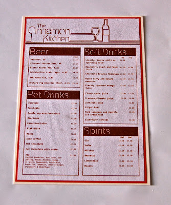
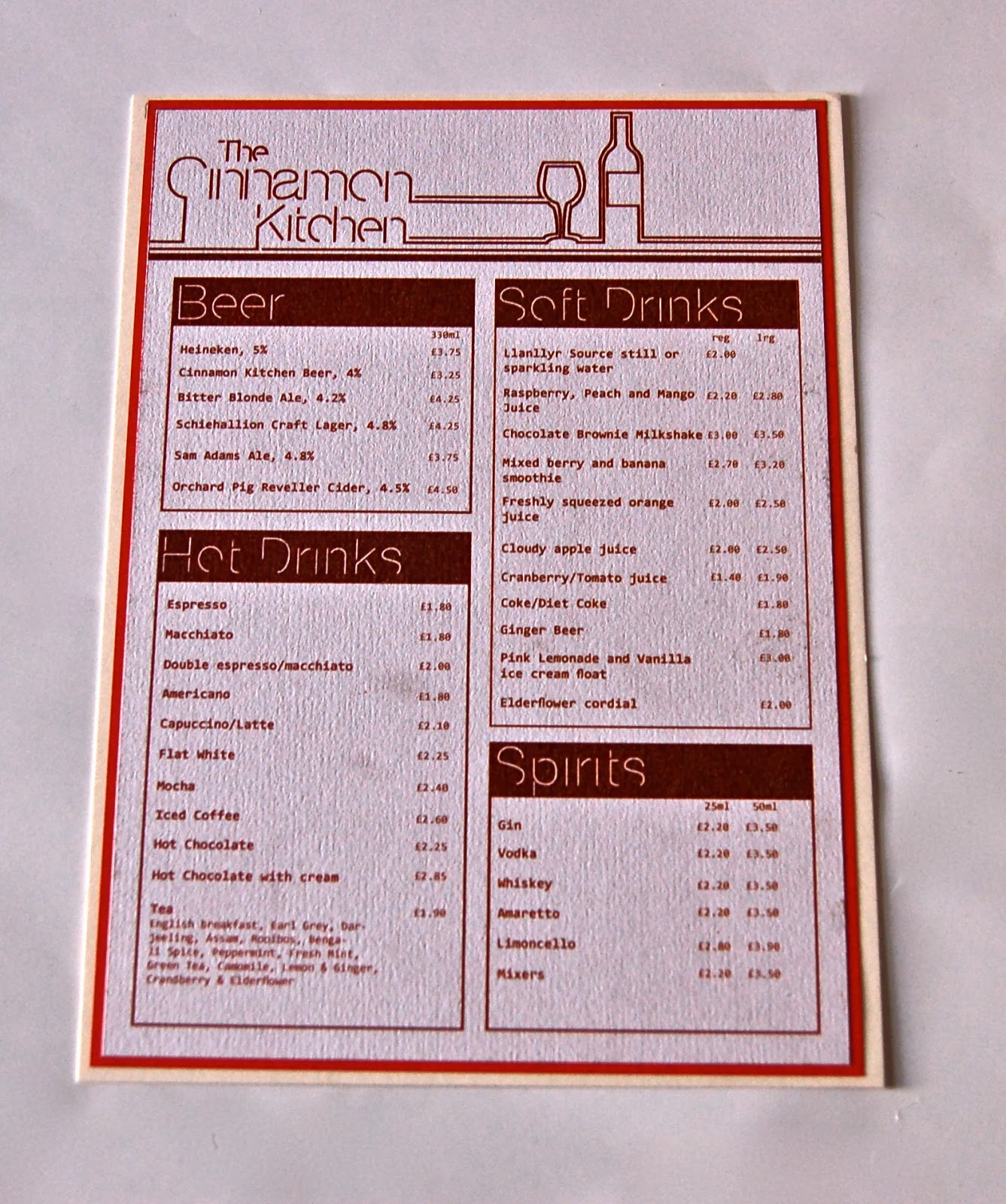
OUGD504 Design For Print And Web Final Images
After having chosen the ivory card stock for my menu's I found that it was difficult to replicate the colour of the design on it. After discovering this I tried to experiment by going down the alternative route I was advised on while in the final crit.
I chose to print onto a light recycled stock, with the idea that the menu's aren't intended to last as long as they otherwise would have on a different stock. This would mean there would be a lot more waste, but this stock worked better with the use of the wooden board, which I decided I would mount the menu onto.
On top of this I decided to create an alternative menu design, by mounting the printed menu's onto the card stock I had originally intended to print on. This will then vary depending on meal, with the lunch and dinner menu on the mounted card stock, as to me this is a more formal meal to go out for than brunch or afternoon tea, the menu's for which will be mounted onto the wooden board.
I was unable to produce much of what I had planned due to time constraints and the loss of my purse, resulting in pretty limited options in terms of printing. However, I have tried to create alternatives to this which were routes I considered going down.


OUGD503 D&AD The Body Shop
Based on my research, I had concluded that I wanted to capitalise on the natural and ethical ethos of The Body Shop Brand, and make this the main focus. Another thing that I had gathered from my research was that I wanted to venture away from the photographic element that the brand have previously focused on, similarly I want to find a way to sell a product without making it the primary focus of the poster.
After some brainstorming, I decided to go back to an idea I had used earlier in the year and improve it. I wanted to experiment again with bleeding inks and watercolours onto paper and using them as the design. I found that this method could lend itself to the sort of stripped down approach I was taking to the brand and it's products.
I chose a selection of colours to represent each product (based on the existing packaging and promotion of the product), and ended up with the following:
I found that some of the colour schemes were more effective than others so chose one per product to use for the posters, and positioned them as I though best caught the mix of colours.
I found that this colour best represented the Body Butter, as aside from the colours appearing natural and similar to that of skin tones, it is also similar to the colour of the product itself.
The existing packaging for White Musk Eau Du Parfum uses a very similar colour scheme to the colours in this design.
I found that this combination of colours best represented the Colour Crush Lipstick, which has a selection of very vibrant pinks and reds.
Similar to the White Musk, these colours best reflected the existing packaging for the Nutriganics Drops of Youth.
I chose a more diverse colour selection for my campaign poster (for Refuge, a charity that supports women and children that are victims of domestic violence) as I thought this would best encourage diversity within the campaign:
Subscribe to:
Posts (Atom)