Before we knew what this brief was, we were put into groups of 5 and given a topic to research, ours was Communication Skills. We broke it down into smaller areas and each of us researched one. Our research needed to be categorised into 3 different boards; one primary research, one secondary research and one with the information that we found most interesting/relevant out of all our research.
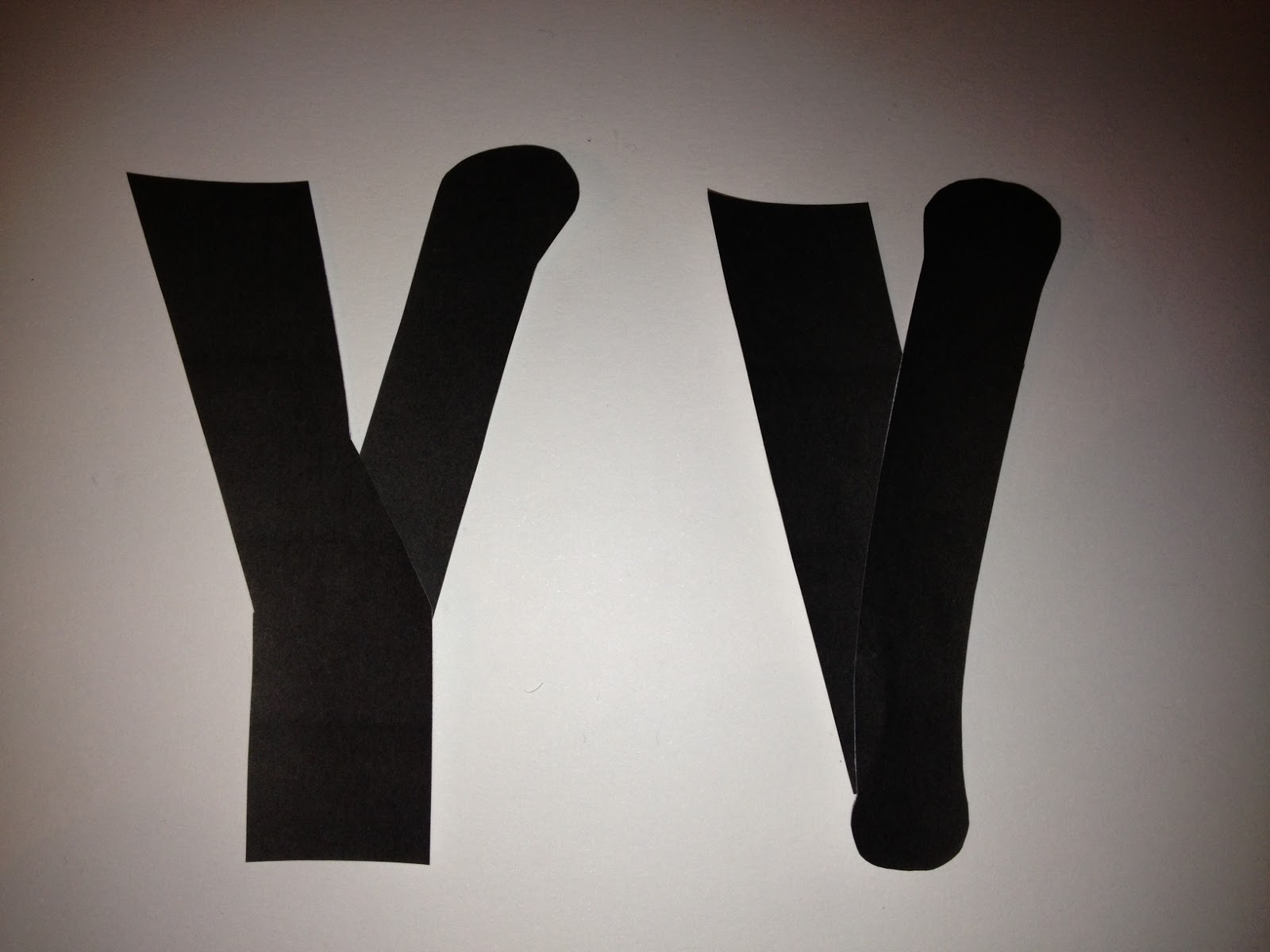
My research was focused on signs, symbols and sign language. For my primary research, I asked people what they interpreted the hand symbols below to mean, with the outcome all being similar. I looked briefly at signifiers, asking people what they associated with different countries. This allowed me to gather certain things that were identifiers for countries.
Much of my secondary research was looking at sign language as a set of universal symbols, understood globally (for the most part). I found that, depending on the country in which a speaker learnt, there were slight variations because in each place the language was spoken, taught and learnt in different ways.
For my final board, I chose to focus on the sign language and the idea of countries flags as identifiers from the primary and secondary research. I also brought in some information on signage from airports and universal road signs, and focussed on how a simple image and idea can become known for something much more complicated all over the world.
We came back into our groups for our crit, after which we were given our 'How To Get People To Speak As A Form Of Communication' brief. After having difficulty getting all 5 of us together, it was decided that the group should split into two, so Joe, Leo and I became one group.
However, two out of three of the collections of research we had gathered were based on non-verbal forms of communication so we found the we became quite limited with information.
We decided it would be best to focus on communication skills, directed perhaps at people who struggle with shyness when communicating and those who might have to meet new people. We would focus on how be at ease and communicate confidently, teaching people about how to effectively execute different forms of communication.
We planned on being interactive to help people conquer any fear they have of speaking to people in a relaxed environment. We planned exercises and tips to be included with promotional posters and handouts.
Joe began to plan and design the logo, keeping it simple and always in touch with the communication theme. After a few designs, it was decided that simplicity was key and he simply broke down the word 'communicate'.
This was Joe's initial design but after considering the legibility of the type with the circles in the background, he completely changed the design.
It was decided that the new design was more fitted to our concept, as it's readable, simple, but still interesting. It's noticeable but discreet and none of the elements of it draw away from the importance of the subject.
Meanwhile Leo had been designing the poster, with a simple logo and design that don't take away from the topic. It included tear off information at the bottom which would allow people to pocket information and help for when people will need to communicate publicly or casually. It was kept light-hearted in the hope that readers would be able to reflect that attitude. While it was quite laden with text, the information given was vital to our project and helpful to whoever might need it.


To accompany the promotional information, we designed a game to help people understand the effectiveness of verbal communication and how the most basic things can be extremely difficult to translate into non-verbal communication. While our research proved that communication mostly consists of body language, tone of voice, emphasis, and eye contact, these things all convey a mood or expression and don't express the words themselves. The game we came up with it similar to charades but with everyday expressions that aren't as easy to express as people may think.
We came up with cards that had a phrase used commonly, and the reader would have to translate the words into non-verbal communication, without uttering a word. The surprising level of difficulty with some of these highlighted how much easier it is to communicate verbally. It also allowed players to understand what non-verbal tendencies accompany the phrases, allowing them to be able to interpret both.
We found that much of the audience enjoyed the game and seemed engaged with it. The light-hearted nature of it meant that it was hard to actually have anyone feel uncomfortable or shy. While it would seem that our group have very little problem with verbal-communication, It did put everyone at ease and still highlighted the importance of different forms of communication.