For this task we had to dissect Gothic, Roman, Block and Script fonts and rearrange the anatomy of each letterforms to create a wide range of new letterforms that could later be transformed into a new typeface.
The fonts I chose to dissect were Lucinda Grande (Gothic), Footlight MT Light (Roman), Impact (Block) and Marker Felt (Script).

I tried to develop the new letterforms systematically in order to ensure that I developed all the variations I could. I have chosen some of the most successful letterforms of the 302 that I created.
Open publication - Free publishing - More form
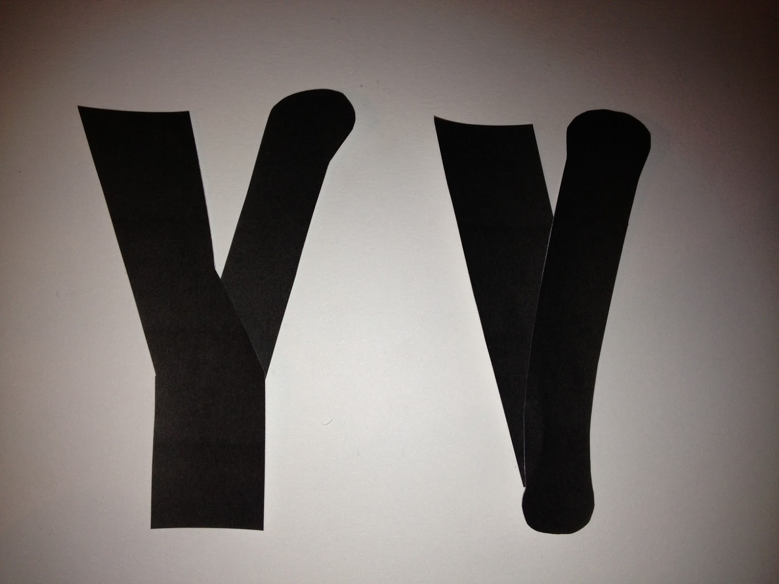
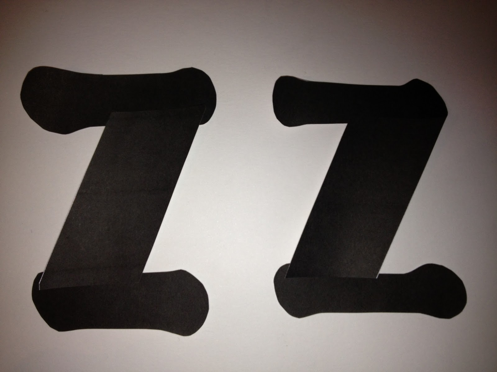
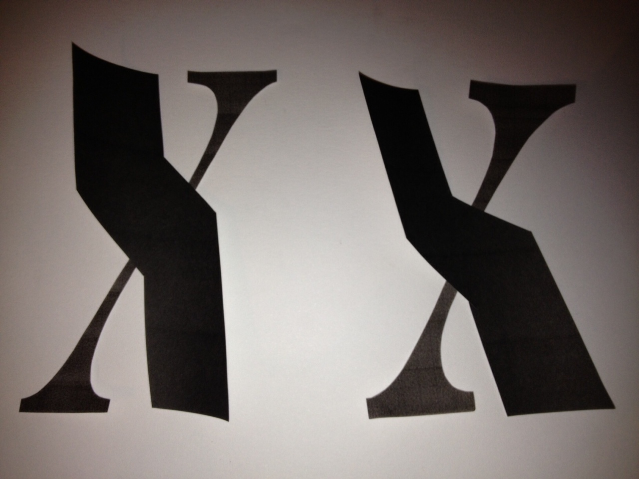
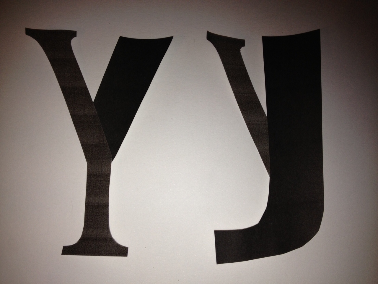
I chose the five a considered to be most successful and created the Aa, Bb, Cc, Xx, Yy and Zz
variations.
1. This font was a combination of the Gothic and Script fonts. I tried to keep it so that the majority of the letterform would be Gothic with only one Script element but I could only keep to this for the Aa and Bb as with most of the others symmetry and even weighting was fairly important, especially for the Cc and Zz. I named this 'Centrality'.


Hand- rendered versions

2. The next font is very similar to the first one I did, and was a combination of Block and Script and maintained similarities in weighting to the Centrality Bold font as I tried to use the same technique but again I did have to end up altering it. I named this one 'Cumbrous Bold'.


Hand-rendered version:

3. This font was a pretty simple combination of Block and Gothic. Since both have similar qualities the only obvious distinction was the varied weighting. I tried to keep the heavier parts to a minimum so as not to overshadow the Gothic parts. I named this font 'Scabrous'.


Hand-rendered versions:

4. This was a cross between Roman and Script, and while ordinarily these two groups would bare some similarities, Marker Felt is a much more 'blobby' typeface than other Scripts, making it seem quite childlike. However I feel that the infusion of Roman elements neutralised the childlike qualities a bit. I named this 'Convexity'.


Hand-rendered versions:

5. The last variation was of Script and Block, probably the least similar of all the groups, but when put together, there weren't any parts that I felt were out of place and I found that they worked quite well together, complimenting the characteristics of the other parts. This one is called 'Gallant Bold'


Hand-rendered version:

No comments:
Post a Comment