I found after doing some research that there were plenty of Motion Graphics blog based sites but that none of them focussed solely on recent motion graphics within the industry of Graphic Design. I feel that this is an area of design that is so captivating and is slowly becoming a topic of huge importance within the world of advertising and animation.
Below is one of my design boards that identifies the research into other webpages I did and how this informed my final concept for a website. I wanted to move away from the idea of blogs as the main focus, however am still quite interested in having some involvement from young professionals or students.

I concluded after looking at some of these sites, that I would create a website with a newsbased format, the focused on motion graphics in the news at the time, in the categories of design, advertising, TV/film etc.
I want it to be a site that people interested in this field would want to visit often and stay on to keep themselves updated in this area of design.
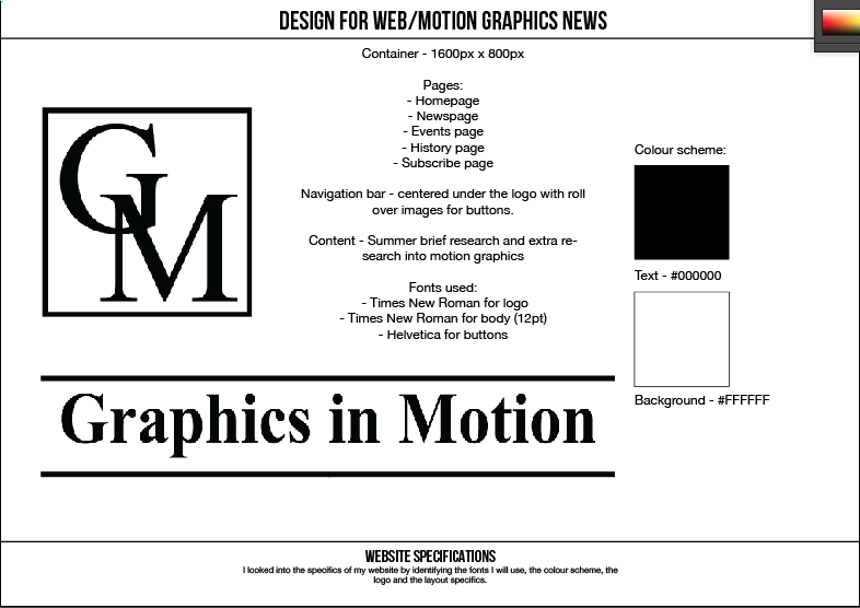
Below are the design pages that identified the scamps and make up of the website. I knew it was important for me to have a news page, since that is the primary focus of the website, but on top of that I chose to include an events page, identifying exhibitions and shows in the country that had a focus on motion graphics.
As well as this I wanted to include a history page that would allow the viewer to look at a brief history on the topic and how motion graphics has reached the level it is at today. Finally, I though it could be interesting to include the option for the viewer to subscribe to the website for free, allowing them to receive updates, new releases and perhaps gain advanced notice of competitions.


I worked out the wireframes of each individual page based on the container being 1600px x 800px, and chose to incorporate the measurements for a potential Twitter feed, and external social media links. I wanted to make the title and general make up of the content quite structured and similar to that of Times Online of Mail Online, to exaggerate the news focus of the website, and so did this by using Times New Roman for the title and the logo of the website. Apart from images I chose to keep it black and white to lend itself to a newspaper element.


No comments:
Post a Comment