I referred back to some of the research and found that this visual was quite a common theme, so I would have to take care in ensuring that it didn't end up being too similar to these.
I thought briefly about also using a jar instead of a bottle, but found that since it was vodka and not moonshine, it would be more suited to being in a larger bottle. I had a square shaped glass bottle of Beefeater gin that I had previously bought, and thought the shape of that would also lend itself to the theme.
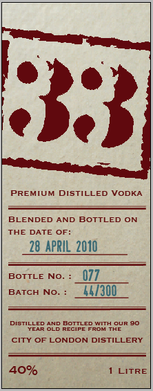
Given that the labelling and packaging for the moonshine was all quite makeshift, I decided to do a redesign of the logo, giving it quite a broken appearance as though it were stamped onto products.
I chose to use a typeface called 'Army Stamp', and then created a square shape around it to look more like a stamp.
I chose a dark burgundy colour, as the only ink that would have been used at the time would have been black, but even the colour change made it slightly more modernised. With this in mind, I wanted to make the stock similar to that of a parchment paper, as this would have been cheap and easy to get a hold of at the time.
I still used 'Copperplate' for the body copy as I felt the slight serif on it would work with the printed materials, making it also appear quite stamped.
For the reverse label, I found that older bottles and brands were often brandished with a stamp of the date they were bottled, the bottle number and the batch number. I wanted to feature this on the bottle to give the illusion that it was part of a small production.
I used a different stamp style typeface for this part of the label, called 'Stamp', which in blue resembled the aesthetics of the stamp that would be used to identify bottles.
I quickly looked at how the colours would translate when they were reversed, because a darker background could modernise it slightly.
I found that this version lost a lot of the rustic quality the previous label had, so I used the first one, with the idea of using this aesthetic perhaps on another printed product.


No comments:
Post a Comment